Design has increasingly become a topic that is thrust into the spotlight. Today, companies like Chobani, Coke, and even McDonald’s are focusing on evolving their comprehensive branding and design systems to spark conversations with existing customers and reach new audiences with new, striking visuals or redesigns to their identities.
At Rizco, we strive to establish relationships with our clients that aid in understanding the full brand — from messaging and tone to positioning in key markets — but at our core, design excellence has always played an integral role in the services we provide. Our Art Director, Stephanie Salerno, helps conceptualize and execute creative solutions across the print and digital spectrum to help brands keep up with ever-shifting needs of industry, communities, and ultimately their customers or constituents.
In today’s often harried and information-overloaded society, these shifting industry needs seem to be planted in the design concept that less is, indeed, more. “2017 was about simple ideas, executed with intelligence and insight to create a real, radical impact. … If 2018 is going to be as chaotic, channel-hopping and crazy as 2017 was, elegant logic will be the only way to cut through.” Chris Moody, creative director of Wolff Olins explained in an interview on CreativeBloq.com.
Salerno agrees with that sentiment, adding, “The ‘less is more’ trend is not a short-term concept for us to only use specifically in 2018, but rather a timeless standard we employ in nearly every project.”
Salerno directs and designs branding systems and guidelines, websites and digital media such as video, email blasts, and social media graphics; as well as annual reports, presentation decks, brochures, and stationary – and the list goes on! While she uses the “less is more” design concept regularly, she is consistently learning new skills or technologies and applying different design concepts that work across channels. “Every time I think I have explored all there is to graphic design and all the latest platforms, there’s something new to learn and add to my wheelhouse of offerings.”
A New Design Direction?
Patterns and palettes inspired by the 80’s and 90’s are prevailing – coming into the mainstream once more as a “new” trend. This is accompanied by the necessity for businesses and graphic designers to take bold risks with design, while still employing the ideas and lessons learned from the “less is more” mantra.
“It’s important to strike a balance between timeless, efficient design systems and ever-changing, unique visual representation of brands,” Salerno says.

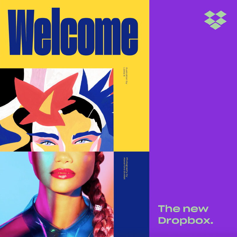
“While companies like Dropbox — who in 2017 revised their branding with an expansive color system, unapologetically loud typography and hand-drawn illustration — took a giant leap by introducing a new look, they maintained brand recognition by keeping their logo mark, core color palette and overall aesthetic cleanliness. Employing ‘fast-design’ trends can be risky for any brand, but through creative-thinking and solid execution, there’s no reason why brands can’t have the best of both design worlds.”
While sometimes a complete rebrand is necessary, at other times all it takes to reinvigorate a strong brand is a small visual refresh or a new approach to handling marketing between channels. Through Rizco’s research-based approach and six-step process, we assess brand landscapes and identify when and where to leverage a new marketing or design change.
Take a look at some of our examples including Plum Practicewear and New World Production Group!


