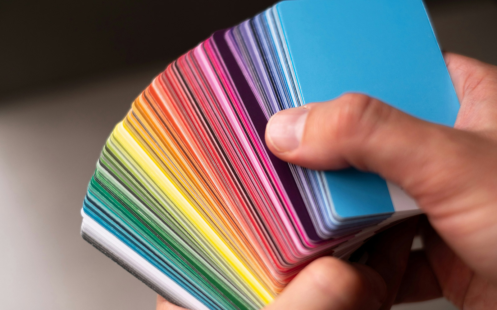
Color is one of the most influential tools in marketing and design.

Color can evoke emotions, shape perceptions, and drive consumer behavior, making it a critical consideration for brands and creatives alike. Understanding the nuances of color is essential when crafting a visual identity, designing marketing collateral, or planning seasonal campaigns. Here, we explore effectively selecting and using color in design and marketing.
The Impact of Color on Marketing
How Color Influences Consumer Behavior
Color is a powerful driver of consumer behavior. It communicates messages quickly and can influence purchasing decisions. Consider how brands like Coca-Cola use red to evoke energy and excitement or how Tiffany & Co.’s signature blue conveys luxury and sophistication. Similarly, McDonald’s combines red and yellow to stimulate appetite and create a sense of urgency. Color becomes a recognizable extension of the brand’s identity and builds trust over time.
Using Color to Evoke Emotions
Colors are deeply tied to psychology, and brands can use them to elicit specific emotions:
- Warm Colors (Red, Orange, Yellow): Energizing and stimulating, these are ideal for calls to action or playful branding.
- Cool Colors (Blue, Green, Purple): Calm and trustworthy, often used in healthcare or financial services.
- Neutral Colors (Black, White, Gray): Elegant and timeless, great for high-end branding.
Exploring Color Trends
Staying current with color trends allows brands to maintain relevance and show they’re attuned to cultural movements. Brands can identify and incorporate these trends by carefully analyzing their audience’s preferences and aligning trendy shades with their existing visual identity. For 2025, Pantone’s Color of the Year, Mocha Mousse, is a rich and inviting neutral that pairs perfectly with bold or muted palettes. This earthy tone reflects a global shift towards warmth and simplicity in design.
Selecting Color for Design
Using Color Theory
Color theory explains how different colors interact and how we perceive them. It introduces key concepts such as primary, secondary, and complementary colors and analogous and monochromatic color schemes. This theory is a valuable guide for designers, helping them understand how to achieve color balance and select color palettes that evoke emotions and make a lasting impression. By breaking down how colors harmonize, color theory enables designers to make informed color choices that resonate with users and enhance brand identity.
Choosing Complementary Color Palettes
A well-chosen color palette sets the tone for a cohesive design. Complementary colors, positioned opposite each other on the color wheel, create vibrant contrasts, making them perfect for dynamic and attention-grabbing visuals. In contrast, analogous colors that are next to each other on the color wheel and share a common hue create a harmonious, balanced, and cohesive look. For instance, a brand using navy blue as its base might add complementary soft oranges to highlight key elements or analogous shades of teal for a unified look. A great example of this is the rebrand we did for our client, Genesis Labs. We refreshed the color palette with balanced, vibrant pink and purple hues, allowing them to break free from competitors’ traditional, muted tones and evoke the essence of trust, technology, and science. These strategic color choices shape how a brand is perceived and how effectively it conveys its message.

Want to dive deeper into crafting effective color palettes? Check out our blog on creating harmonious designs here.
Balancing Aesthetics with Readability
Design isn’t just about looking good—it must also be functional. When selecting colors for text and backgrounds, readability must be prioritized. High contrast ensures accessibility and clear communication, while low-contrast combinations, such as light gray text on white, can frustrate users and weaken your message. For example, websites using low-contrast palettes often see higher bounce rates, emphasizing the importance of readability in enhancing user experience. Opting for dark text on light backgrounds maintains accessibility and ensures content clarity.
Color for Print vs. Digital
Colors behave differently across mediums due to the distinct ways they are processed and displayed. Print design relies on CMYK (cyan, magenta, yellow, and black), which uses subtractive colors that absorb light to generate over 16,000 color combinations, generating vibrant hues through light emission. Meanwhile, digital screens use RGB, an additive color model (mixing light increases brightness) that relies on red, green, and blue to create over 16 million possible colors.1 Designers must account for these variations by testing and fine-tuning colors to maintain consistency across print and digital formats. For example, designing a mobile app? Use RGB to create compelling screens. Creating a physical billboard or business cards? Go with CMYK for clear, crisp colors.
Balancing Trends with Brand Colors
While trends are exciting, they should never overshadow a brand’s core identity. Instead, use them to enhance or refresh campaigns. For instance, a brand with a cool-toned palette can incorporate touches of trendy warm colors like Mocha Mousse in its advertising without straying from its primary identity. This approach ensures designs remain modern yet recognizable.
Color is more than a visual element—it’s a strategic asset. By selecting the right colors, balancing trends with timelessness, and understanding the psychological impact, brands can create compelling designs that resonate with their audience and drive meaningful results. Whether you’re refreshing your brand’s look or planning your next campaign, thoughtful color choices will always be at the heart of great marketing.
1 https://www.figma.com/resource-library/what-is-color-theory/


