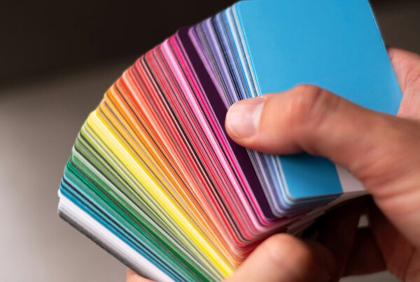
Color is an integral part of your brand.
It is a key recognition tool that can evoke emotion or action, influence a consumer’s perception of your company, and represent your personality. Bottomline, color has meaning and the selection process is critical for getting your brand launched on the right foot. Interestingly, more goes into color selection than choosing between bright v. dark, vibrant v. muted, simply because “you like it.” In fact, the science behind brand colorization is complex, and if you’re not capitalizing on it, it could end up hurting you in the long run. Let’s analyze the top three factors to consider when selecting brand colors and how they can lead you to the perfect hues to represent your business.
1. Understanding Color Popularity in Your Industry
Did you know that over 80% of organizations in the healthcare sector use blue in their logos? This is because, according to color psychology, patients associate blue as professional, calming, and powerful. While this is great for conveying trusting emotions in patients, it can provide differentiation challenges when all competitors utilize the same palette. As a leader, you have to decide whether to fit into the mold or do something different and sometimes the solution is to incorporate “like” colors as secondary colors where they are lighter or darker in variation across your marketing assets. It depends on your company’s goal, the services you provide, and the target market you are looking to engage with.
The first step is to oversee a competitive landscape analysis, which is a valuable process where it is important to identify your competitors and cross-compare their visual and verbal brand strategies against your own to determine your strengths, weaknesses, and what we like to call “your secret sauce.” The outcome of this analysis allows an organization to drive colorization shifts in a methodical manner. If this seems like a daunting task, the employment of a brand-led marketing agency is recommended to drive the process.
2. Establishing Primary and Secondary Colors
When choosing your brand colors, your final selection should include your primary colors that are at the forefront and remain consistent, followed by secondary options that can be updated more frequently as services, trends, and marketing initiatives evolve. Both are critical in creating a roadmap to follow when marketing assets are built out.
So how do you choose? Your primary colors are simple; they’re the most important colors to your brand (typically your logo) and the main message you’re trying to convey. So, whether you’re looking to symbolize youth, serenity, innovation, etc., this is where you’ll emphasize those hues. The colors in your primary palette should all pair well with each other in both aesthetics and messaging. For instance, if one color in your primary palette is meant to represent excitement, but another is most associated with a calming effect, then this could make your brand appear chaotic. Finally, your secondary colors are typically those used for supporting content and imagery and should be neutral colors that are legible and cohesive with the overall brand palette.
3. Consider Design Adaptability and Limitations
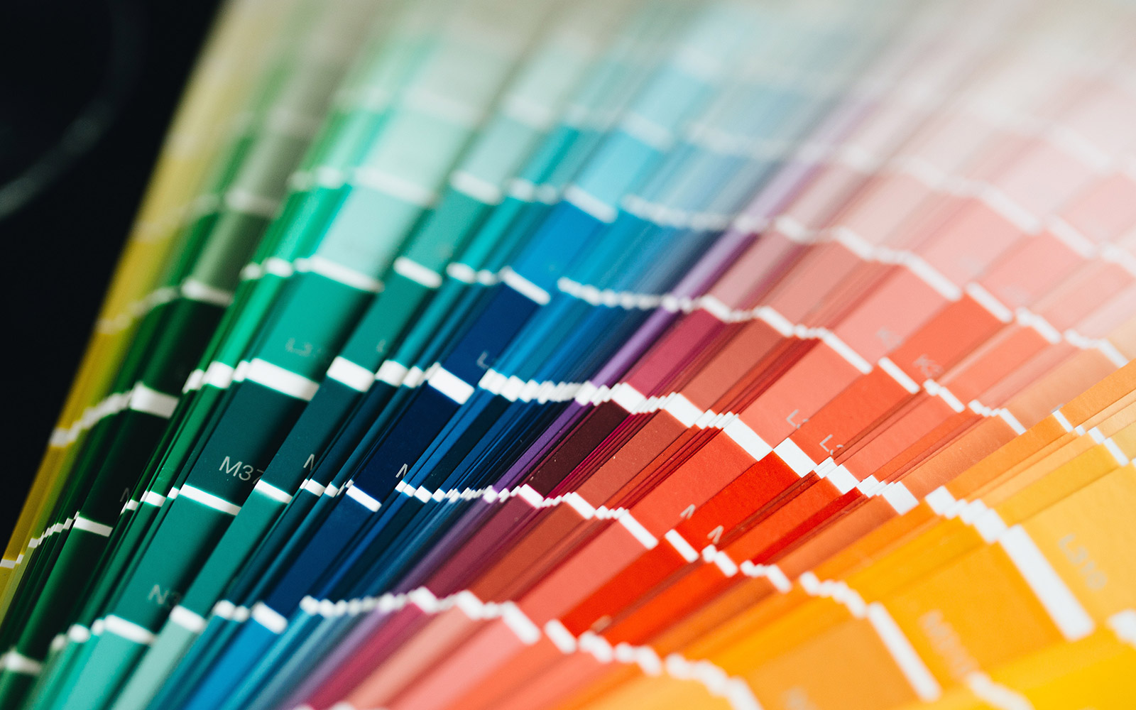
While this is the third factor on our list, it should be an ongoing consideration throughout the process since brands need to be scaled, expanded, and still be recognizable and legible across all communication formats, including social, web, print, and out-of-home, to name a few. Hence, brand limitations need to be considered, which are the potential issues that design professionals could run into when working with brand colors. For instance, a white font on top of a similarly light background makes content hard to read due to the lack of contrast. Similarly, some colors, like yellow or reflex blue, can shift in tonality across marketing materials when they are printed vs. viewed on a phone or desktop computer, which creates inconsistency and can confuse your end-user. Lastly, if you create a custom color that is outside of Pantone’s Color Matching System, it will need to be custom-mixed EVERY time you print, which can cost more and/or lead to color inconsistencies across your materials. To ensure that all aspects of brand representation are being considered, make sure you’re enlisting the help of a brand specialist who will help streamline the colorization process without wasting time or resources.
At Rizco, our branded experts have over twenty years of experience and utilize our proprietary audit process to fuel the branding and color selection process. If you are planning to launch a new brand, refine an existing one, or just want to get a temperature on where you stand in your industry, connect with us to begin the conversation on how color selection can impact your business. Contact us!