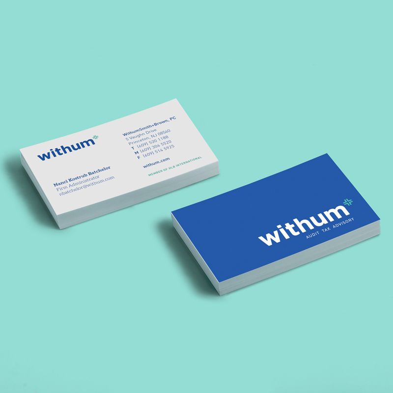
Accounting firm WithumSmith+
Brown has kicked off the New Year with a fresh, new logo, which is just part of the company’s redesign.
The former logo was designed 15 year ago, and Rizco had the exciting opportunity to be a part of the 2016 redesign. Part of the rebranding involved shortening the name of the brand, unofficially, to simply “Withum.”
The goal was to introduce a new logo that reflects who the company is currently – a firm that’s easy to work with – while still being recognizable.
The elements of the new logo include the “Withum” name in bold typeface, a superscripted plus sign as its mark, and the words “audit, tax, advisory” as the tagline. The plus sign, which is synonymous with Withum, is the universal symbol in the accounting profession representing ‘being in the black’ and positive results. This in turn, reflects the firm’s mission to be an addition to every client’s team, which is a perfect representation of the firm.
According the accounting firm, the new logo achieved the goal of aligning perfectly with its brand, while echoing strength, innovation and boldness in its unique design.
The new logo will be reflected on the firm’s website, its print and digital ads displayed in a variety of business and industry-specific publications, and in all of the materials related to firm communications and promotional efforts.


