Featuring Insights From Keith Rizzi, Rizco Creative Director & Partner
Logos serve as the primary representation of your brand, communicating messages of empathy, purpose, and history beyond mere symbols. Whether you think about it or not, many of today’s most prominent logos are recognizable even when unaccompanied by the company’s name. For example, the Coca-Cola logo is recognizable by 94% of the world’s population. Today, we’ll explore the essential elements of effective logo design, focusing on simplicity, timelessness, and distinction.
Simplicity
Maintaining simplicity in logo design is crucial due to its versatile usage across various materials and mediums. A clean, streamlined design ensures consistency and adaptability in digital, print, or embroidery. Secondly, simple logos are also more memorable and leave a lasting impression on your audience as they are clearly defined. Complex designs and colors can confuse viewers’ interpretation of your brand, potentially evoking negative emotions.
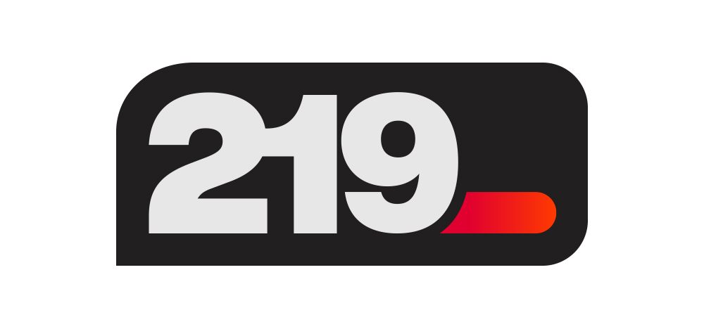
Before & After: 219 Logo
Keith Rizzi, Creative Director & Partner of Rizco, shared, “Beginning a logo design process in black and white is a common practice among designers. This approach allows for a focus on the fundamental aspects of the logo, such as shape, form, and composition, without distractions from color. Versatility and simplicity are emphasized.”
Timelessness
A timeless logo should remain relevant without being overly trendy. Many brands make the mistake of chasing current trends in their logo and brand design, risking their long-term appeal. Avoid fads like hashtags or “in” jargon because they can age your brand quickly. Ensure your commitment aligns with themes and design aesthetics that resonate with your values and suit your business purpose rather than following fleeting trends. For instance, consider last year’s trendy term “Rizz” (meaning charisma); if Rizco were to incorporate an extra “z” into their name spontaneously, it might seem trendy today but could quickly become outdated tomorrow. The bottom line: stay authentic!
Before & After: Withum Logo
Since we covered simplicity, authenticity, and adaptability, it’s crucial to address colors and fonts, which are critical elements in brand identity for their lasting appeal and flexibility. By selecting classic fonts, brands can maintain relevance and consistency across various contexts and extended periods. Keith Rizzi elaborated, “Choosing the appropriate fonts for logo design is essential because typography plays a vital role in expressing the brand’s character, principles, and communication. Legibility, uniqueness, and scalability are key factors, which is why Helvetica, Futura, Arial, Times New Roman, and Garamond are widely utilized for their versatility. Ultimately, the font must align harmoniously with the brand’s identity.”
Distinction
Whether your brand is just starting or you’re rebranding a logo that’s been a symbol of your company for years, no one has to be told the importance of standing out from your competitors. Distinction amongst your competition is essential for memorability. One of the best ways to curate a unique logo identity is through the colors used; however, it is also an easy way for brands to get lost among the competition. That’s because businesses in specific industries tend to gravitate towards the same color combinations. For example, brands in the automotive industry tend to flock towards red and blue because blue incites feelings of trustworthiness and reliability, while red conveys a sense of boldness.
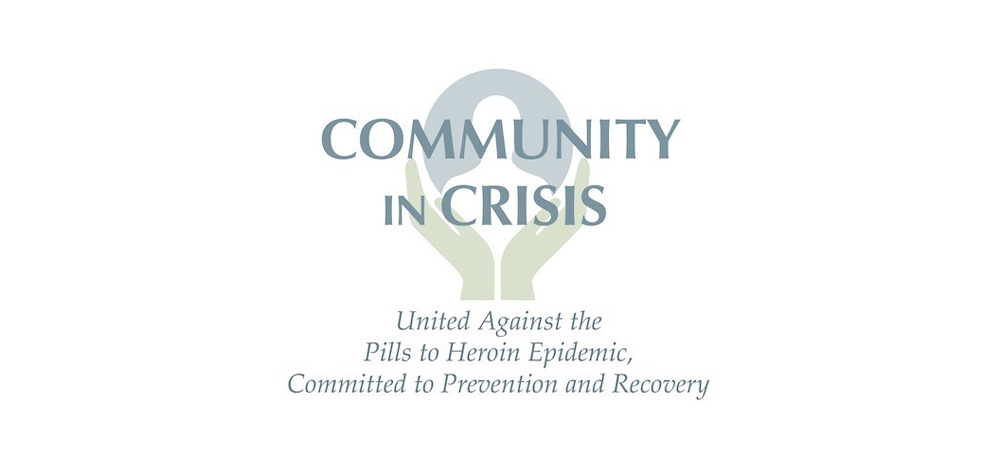
Before & After: Community in Crisis Logo
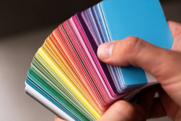
Brand colors are an essential part of brand identity, and translating them into your logo design requires a deeper understanding of the overall message your brand is trying to convey. Here’s a quick breakdown of some colors and the emotions they can trigger for customers:
- Blue: trust, loyalty, confidence, stability
- Green: Energy, growth, regeneration, harmony
- Orange: Passion, optimism, creativity, freedom
- Black: Power, sophistication, elegance, balance
- White: Purity, cleanliness, peace, serenity
- Red: Heightened emotion, boldness, courage, health
It’s also important to note that when paired, specific color combinations can carry emotions for customers. Hence, collaborating with a seasoned design team well-versed in color theory is crucial to crafting a logo with colors that truly embody your brand.
“Certain colors can be challenging to reproduce accurately across different mediums and color systems, such as reflex blue shifting to purple and hard-to-read yellows. Ideally, test colors in various contexts to ensure they maintain their intended impact and readability and consider adjustments for both digital and print applications,” said Keith Rizzi.
Understanding the key elements of logo design might seem daunting when integrating them into one symbol. Hiring a skilled design team can streamline this process by analyzing various aspects of your business—such as your industry, target market, and brand presence—to create a logo that encompasses these crucial elements while positioning your brand effectively.
Do you have a logo concept in mind but require assistance bringing it to life? Or is your business seeking a rejuvenated identity? We specialize in branding solutions that are tailored to meet your needs. Let’s discuss your project together!