219 Design

Your Vision, Engineered

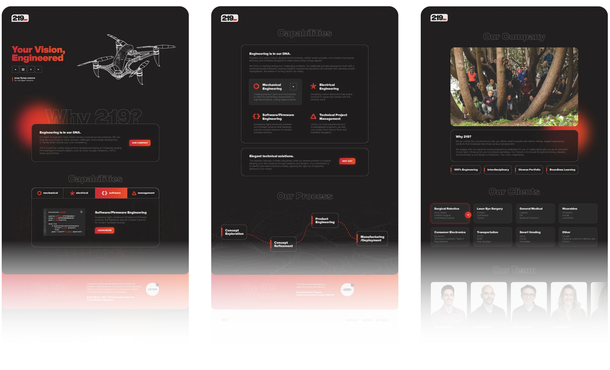
219 is a product engineering firm with over two decades of experience, combining mechanical, electrical, and software disciplines to make clients’ visions a reality.

In 2023, 219 approached Rizco in preparation for their 20th anniversary in April 2024, seeking a brand refresh that would reflect their forward momentum. The challenge: evolve a self-created brand without losing the integrity and innovative spirit started by the company’s founders.

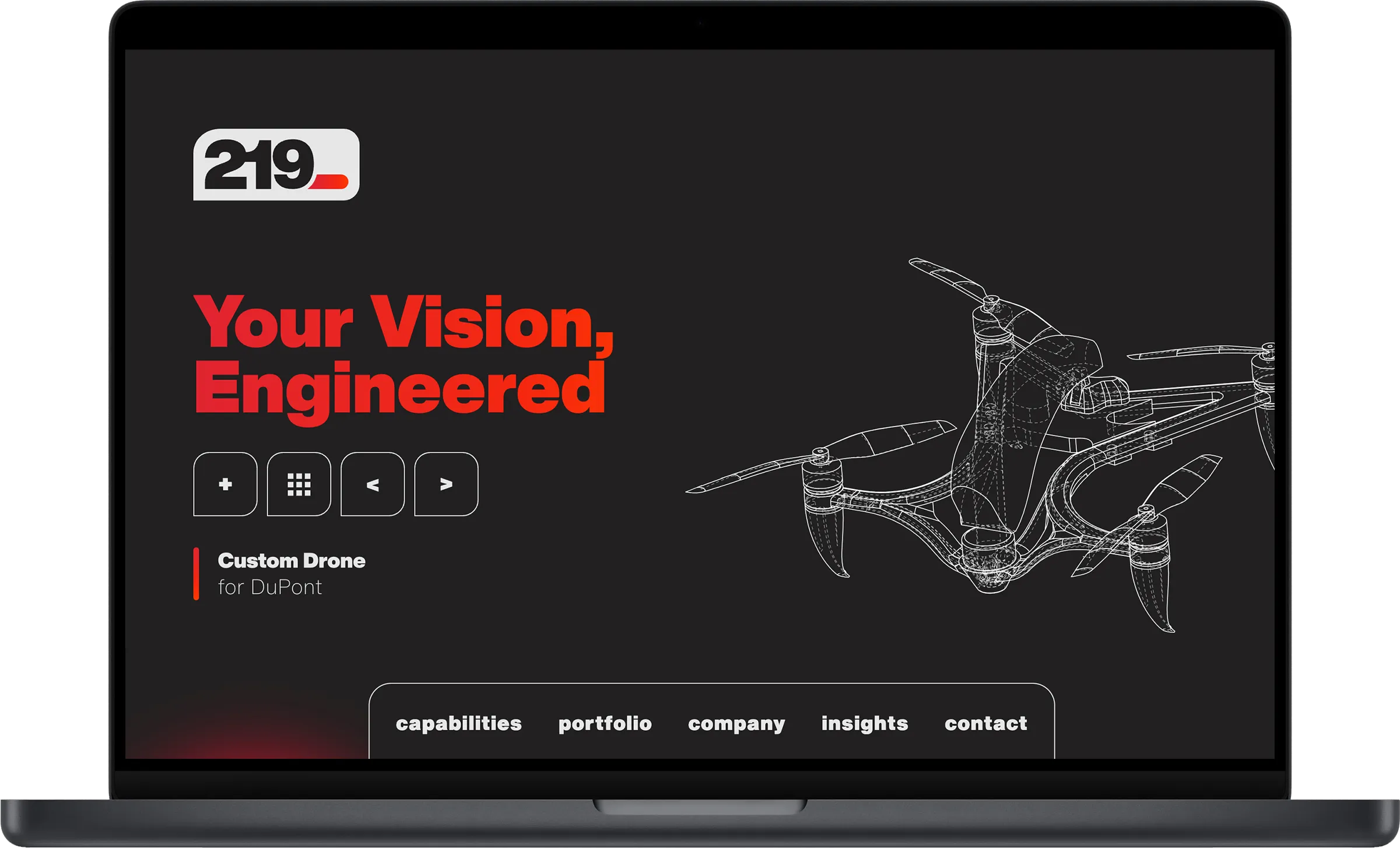
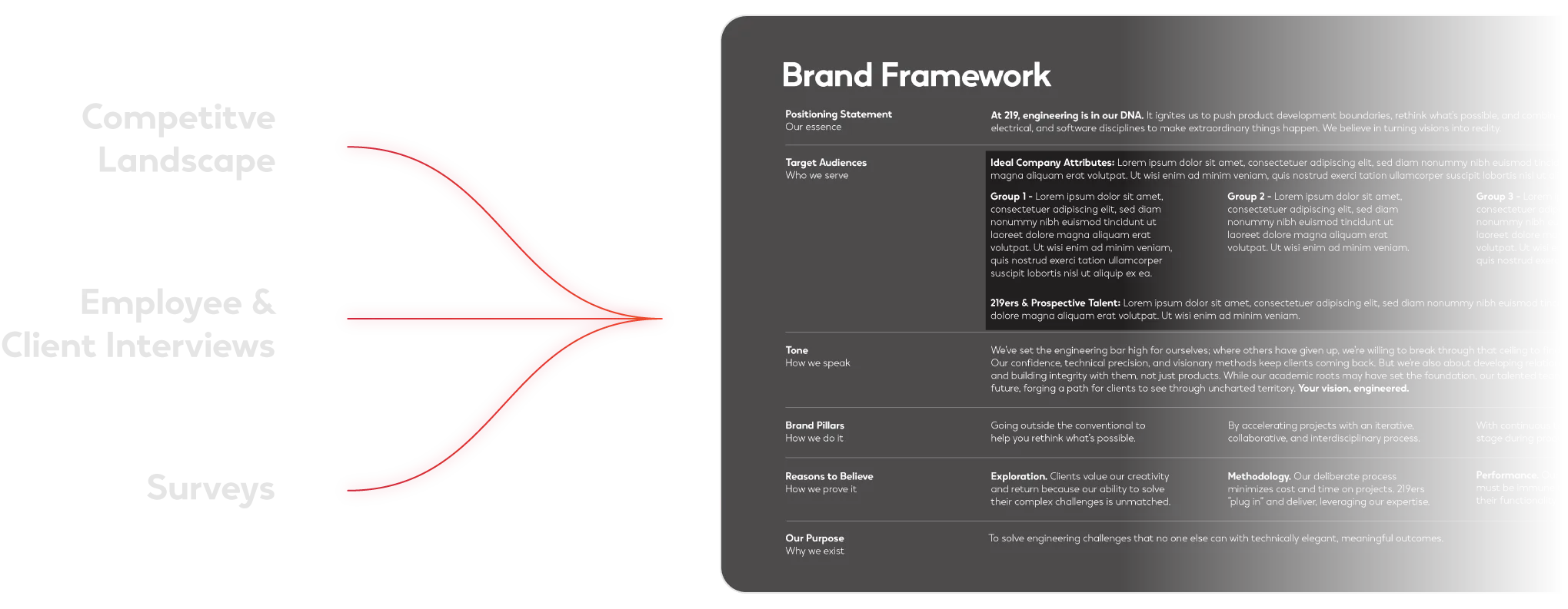
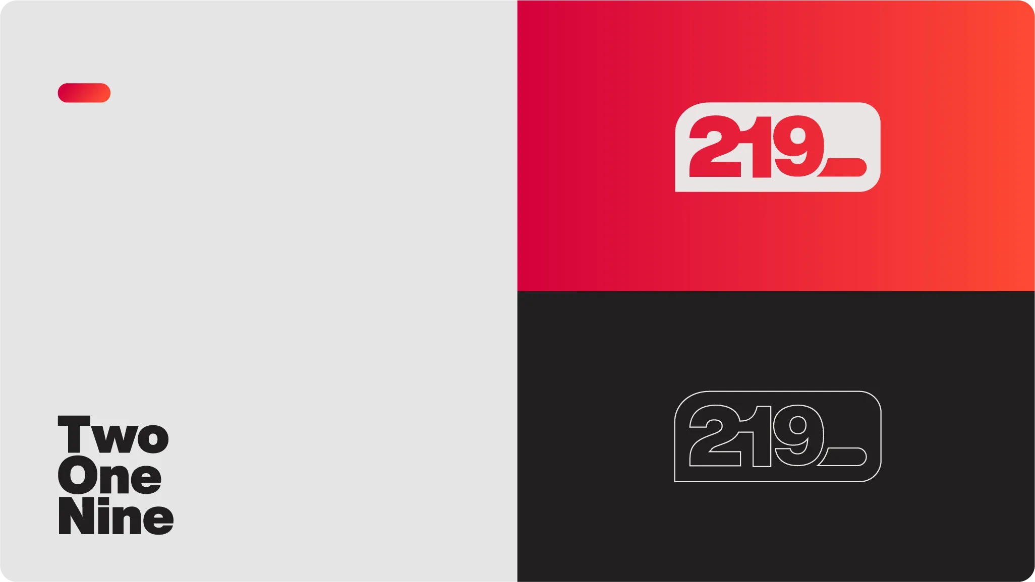
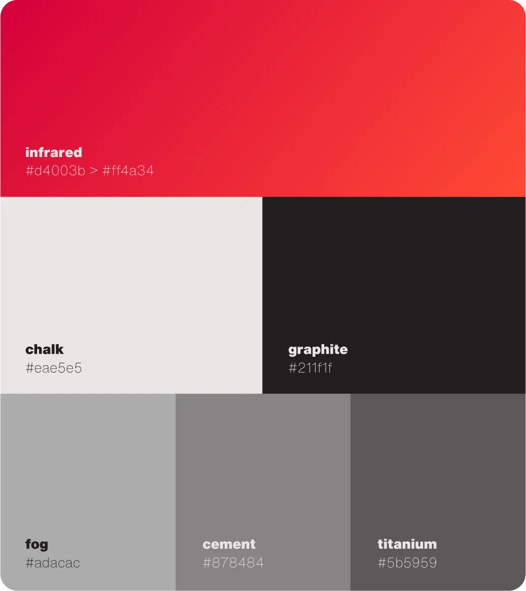
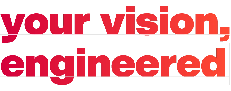
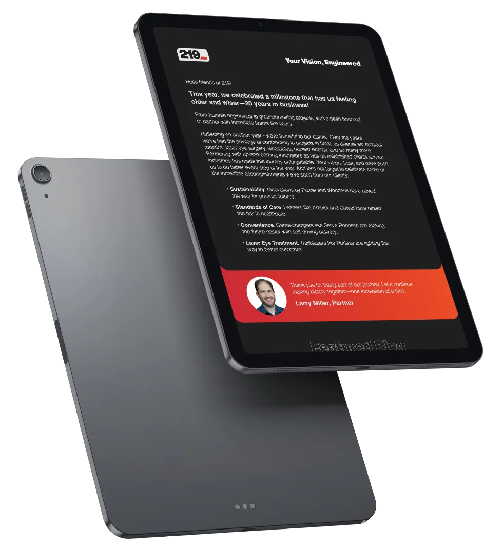
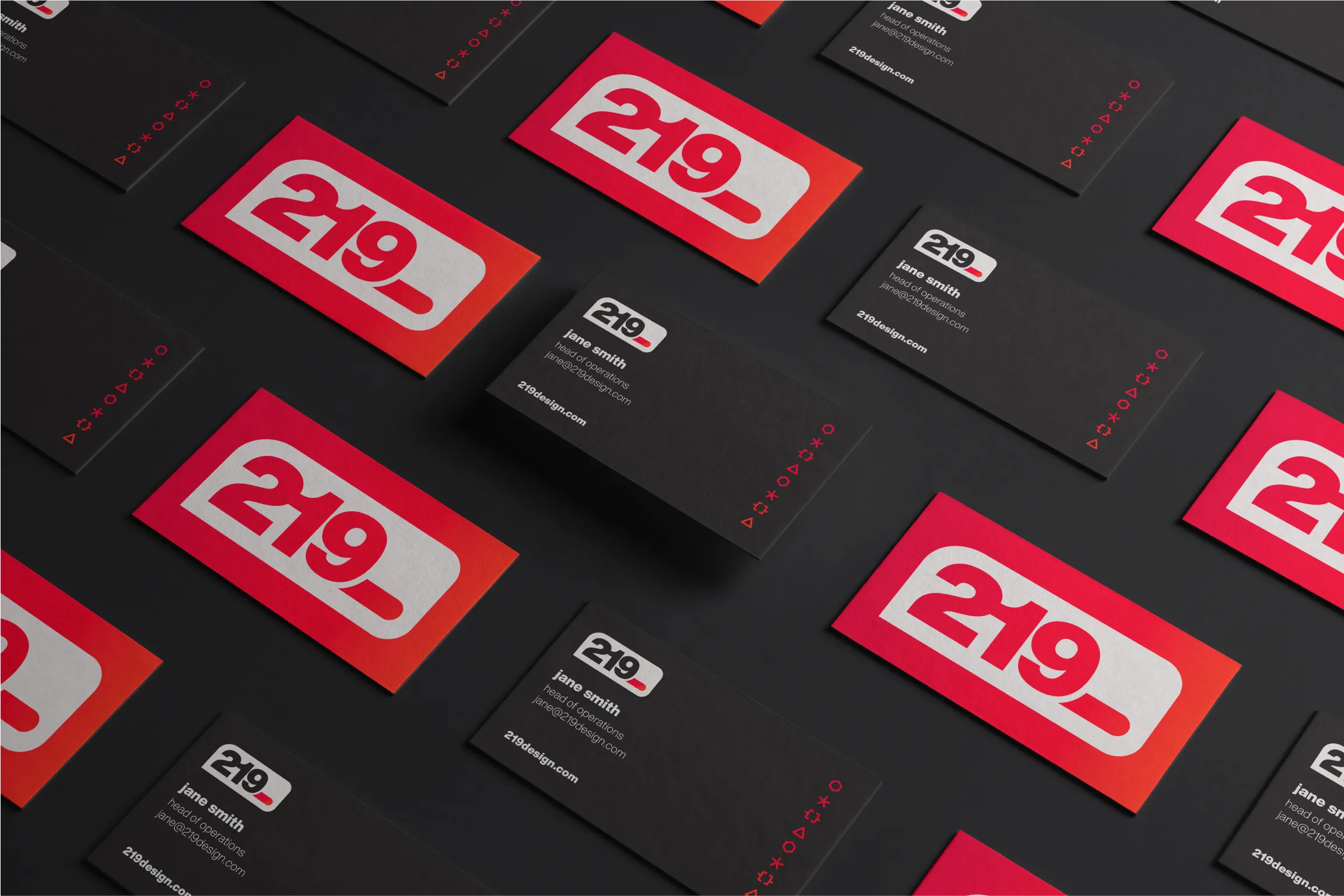
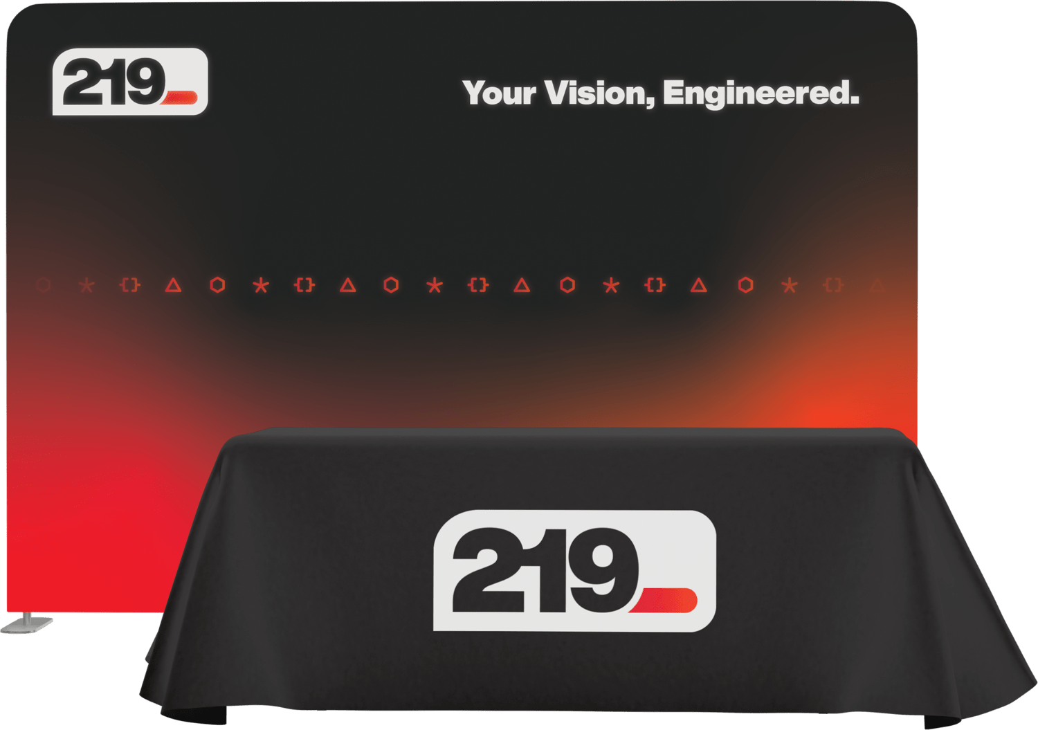
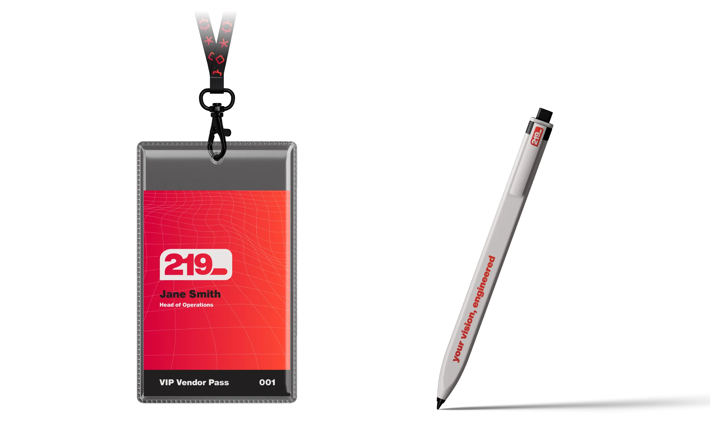
Through a strategic and in-depth brand audit, Rizco laid the foundation for a comprehensive rebranding effort. The result: clear messaging, a bold new logo, a visually engaging website, and a suite of brand assets that position 219 for the next generation of engineering innovation—while preserving the trust and credibility they’ve built over the years.

What We Did

  • Audit & Competitive Landscape
  • Messaging & Positioning
  • Tagline
  • Content Writing
  • Logo & Identity
  • Website Design
  • Website Development
  • Stationery
  • Marketing Assets

Website

Groundwork for brand evolution.

We conducted a strategic and comprehensive brand audit that included internal and client interviews, a staff survey, competitor research, and a full asset review, uncovering key insights to guide 219’s evolution and future brand direction.

Engineered to stand out.

The new logo features a bold, high-contrast mark that fuses the “2” and “1” with the “9,” followed by a glowing infrared cursor—symbolizing forward momentum and a drive to innovate. Designed to stand out in any environment, the flexible lockups ensure strong visual impact across dark and light backgrounds, color treatments, and complex applications.

Technically grounded, visually bold.

The Color Palette evokes an essence of forward-thinking and technological prowess.

Infrared communicates a precision approach in the software space and positions 219ers as visionary, agile innovators.

Chalk communicates a focus on tangible materials utilized to build the client’s vision, with a nod to the hardware of yesteryear.

Graphite communicates a grounded tone and expresses the cohesive, trustworthy prowess that holds everything together.

Fog, Cement, and Titanium support the primary palette, following in the same spirit.

What’s in a name—and what’s not?

Reflecting 219’s mission to go outside the conventional to help clients rethink what’s possible with fast-to-market, elegant engineering solutions, emphasizing test-driven product development.

Iconography with impact.

Each bold, industrial mark is a strong visual signature for the core disciplines, designed to stand alone confidently. The infrared gradient introduces a sense of futuristic motion and modern precision.

A bold, tech-forward interface.

Set against a dark, immersive backdrop, the new website merges form and function, delivering an experience that reflects the brand’s engineering precision. A 3D portfolio homepage slider, a bottom-center navigation, and visual storytelling throughout create a seamless, modern user journey.

Designed to connect.

A custom newsletter template was created to reinforce the brand’s voice with a bold layout, human tone, and modular design, featuring project spotlights, thought leadership, and client success stories that build community and drive engagement.

A striking first impression.

Sleek business cards feature infrared icons and a gradient-backed knockout mark, delivering a confident expression of the brand that resonates long after the handshake.

Consistent in every detail.

A refined, branded sign-off that brings clarity, consistency, and recognition to every digital interaction.

A cohesive tradeshow system.

An illuminated display and branded table skirt set the stage with infrared gradients and bold iconography. Paired with a badge featuring 219’s signature warped grid, a patterned lanyard, and a chalk pen, each element blends technical precision with visual energy to leave a lasting impression.