

Investigating the Integral Role Color Plays in Your Marketing Strategy
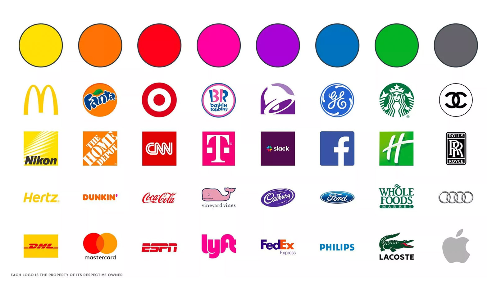
Image sourced from Lab Digital Creative article, “Color Psychology of Branding and Logos,” labdigitalcreative.com/color-psychology-of-branding-and-logos. Accessed 18 Nov. 2021.
By now, you probably know that colors can influence emotions in humans similarly to words and energies. For example, a dark room may make you feel sad, while a bright room can make you feel equally vibrant. On the other hand, though, a space that’s too bright can make you feel anxious.
The same psychology behind how colors make people feel can also be applied to branding, and the colors you choose can play an integral role in your marketing strategy. Why? Because the importance of color in branding runs deeper than sight. In fact, according to psychiatrist Carl Jung, “colors are the mother tongue of the subconscious.”
Whether you’ve thought about it or not, your business’s colors resonate with your customers to varying degrees. Different colors mean different things, so selecting colors that fit your brand is crucial for converting and retaining customers. Today, we’re breaking down how you can use colors to your advantage depending on the type of business you have.

Retail and E-Commerce
When it comes to retail and e-commerce businesses, the goal is typically to sell a product. However, many sales professionals will tell you that gaining a customer’s trust is often the driving force behind the eventual sale. For this reason, using colors that signify trust or positive emotions can be helpful.
Blue is one color that represents trust and loyalty and has a calming effect. Customers who gravitate towards blue feel a sense of security, which can make them believe in a brand’s consistency. Have you ever heard the saying, ‘out of the blue’ when something happens unexpectedly? While the origination of that saying was referencing lightning coming out of a perfectly blue sky, the main message remains clear; blue is consistent, trustworthy, and calming. Brands that use blue have the opportunity to incite those same emotions in their customers.
Healthcare
While one might argue that trust is more critical for healthcare companies to exude in their branding than retail, blue is also the most frequently used color in the healthcare industry, and odds are your competitors are already using it. While using colors that work for your competitors isn’t necessarily a bad thing, it can make your brand easier to overlook versus another company.
The redundancy of blue doesn’t mean healthcare companies should abandon the use of the color altogether; it just means that using other colors in addition to blue can evoke emotion from your consumers and also set you apart from the rest. For instance, healthcare companies who strive for cleanliness, competence, and vitality will incorporate white, purple, and orange in order to represent these traits.
Service Providers
Service providers are a broad category, and there are no one-size-fits-all colors to portray all the different messages service providers need to communicate. For example, law firms will want to convey different messaging than, say, an extermination service. Therefore, service providers need to take a hard look at their core values and find colors that represent these values.
For example, a law firm may want to convey themselves as wise, confident, or powerful, making purple, blue, or black the perfect choices for them. On the other hand, the extermination service will want to send a message of proactive aggression or boldness, making orange and red more obvious choices.
The Food Industry
For food industry businesses, color is especially make-or-break as certain shades of colors can be off-putting while others can be inviting. Another factor to consider is how the pairing of colors can represent different things to potential customers. As stated in an article by LogoDesign.net, “Separately each color has a meaning, and when put together with others in a palette, the meanings and feelings change. Red alone means danger or love, and yellow means creativity and hunger, so when put together red and yellow can mean ‘love for food’ for a brand like McDonald’s.”
Using the right color pairing can encapsulate the meaning of your brand in ways words cannot, and with proper marketing, it can even make your customers hungry by just seeing your signature hues together. However, how can you choose the right color for your food brand? In this case, core values and factors like the type of food you’re producing would work in tandem to deliver your brand’s overarching message.
No matter the industry you’re in, enlisting the help of a branding team and designer who understands the meaning behind colors and the public’s reaction to them is key. At Rizco, our team of designers and creatives will work with you to understand your business’s core values and translate them into company colors that will convey your business accurately. So let’s get started; contact us today!


